Food Sharing
What is Food Sharing?
Food waste is a widespread global problem.
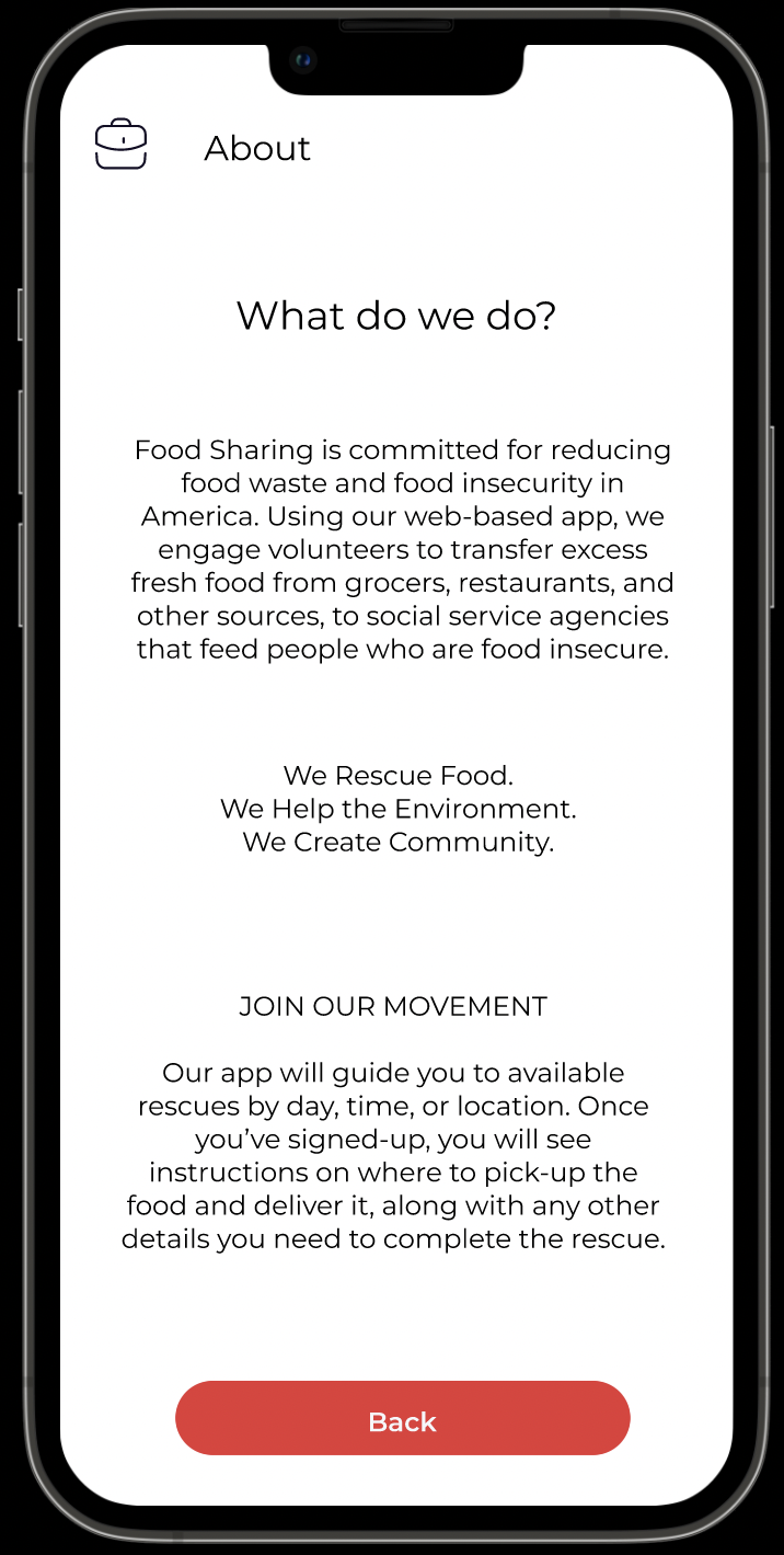
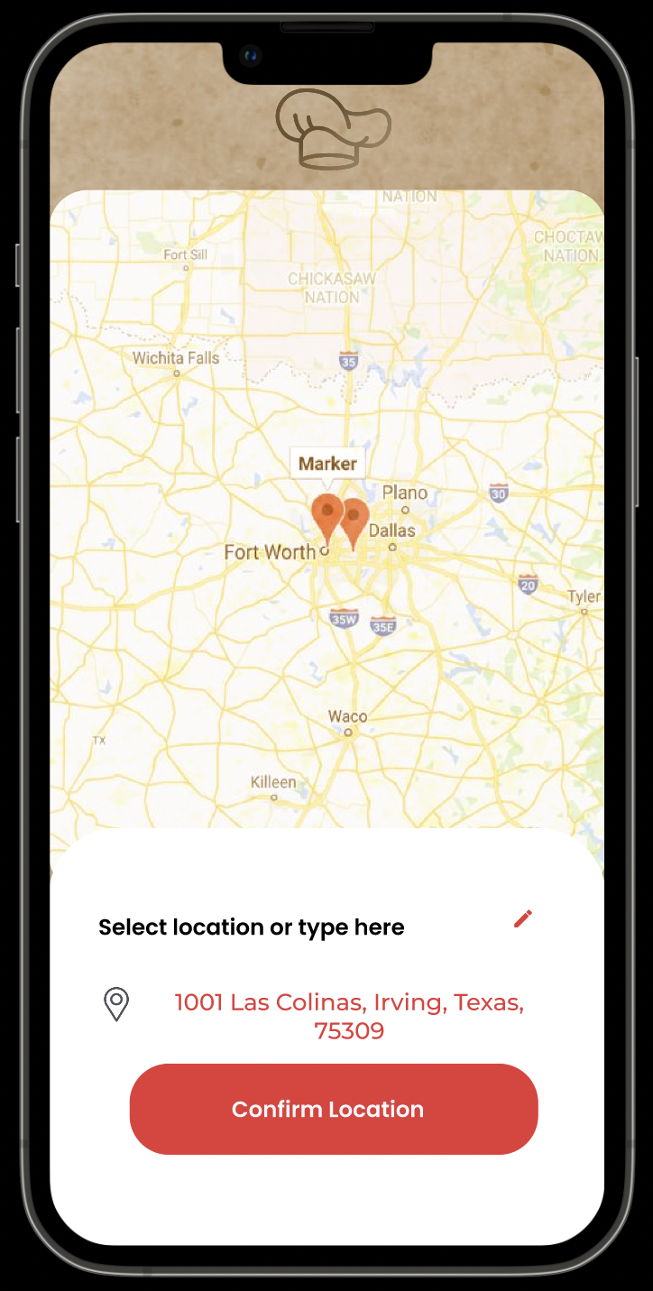
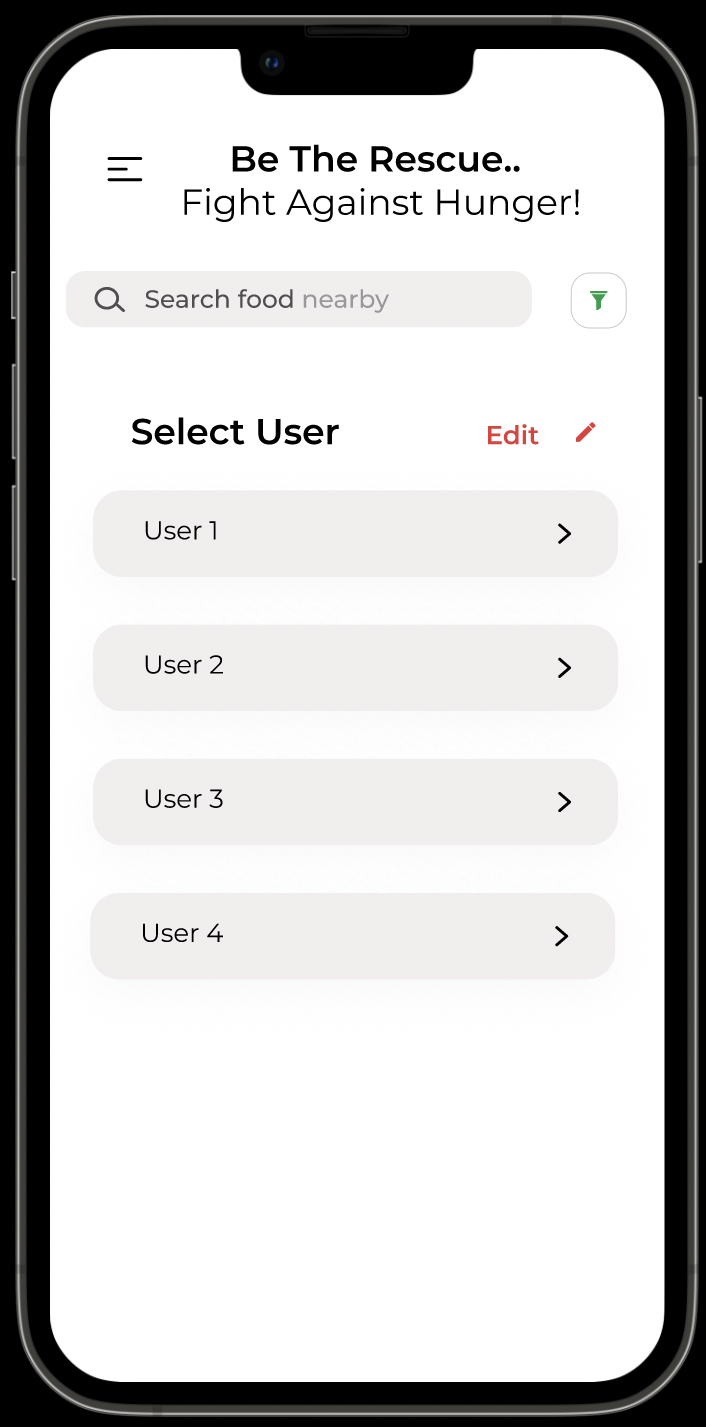
This application seeks a solution. Food Sharing is an application for food donation that allows the user to search for food donation banks using Google Maps. Based on the user’s location, nearby shelters and food donation banks experiencing a shortage of food will display on the map. With this application, anyone in the community, restaurant owners, or food donation banks can donate their extra food rather than wasting/throwing it away. Using Share the Meal, we can spread more awareness to this cause.
Project Overview
Problem
Through research and analysis, we confirmed that a large portion of people are wasting food. As humans, we wanted to contribute to changing this crisis so those who need food would have access to it.
User Analysis
I discovered a lot of apps/websites that had very narrowed targeting. For example, I found an app specifically for orphan people. Therefore, I wanted something that could be useful in conflict, climate change, disasters, inequality and most recently, -the COVID-19 pandemic which was causing the rate of world hunger to rise.
The analysis was very important because according to the ratio 38 million Americans are food insecure, 1 in 6 children face hunger each day. This was important to know as we were building this app from the ground up and wanted to develop a strong value proposition.
User Interview
During the ideation phase of the project, I conducted user interviews to build new personas and to inform the design. Together with the team, we prepared an interview script with 32 open-ended questions, focusing on our target audiences’ values, motivations, and daily routines. In 4 days, I recruited and interviewed 7 users remotely. We referenced the user interview findings throughout the entire design process.
81% of our survey respondents were positive.
42% were regularly checking the donation survey.
69% did not feel fully aware of the habit of wasting food.
1)What objectives influenced your questions?
2)How many users did you interview?
3)What were the main insights from the interviews?
4)How did you use your findings?
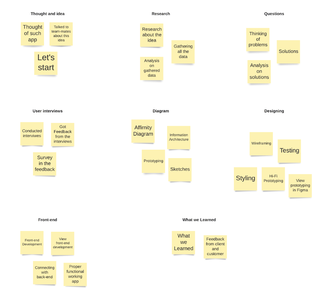
Affinity Diagram
An affinity diagram helped us generate ideas and narrow our focus. After our interviews and thinking about how we could help these people, we were moving in too many directions. Through the diagram, we learned that it’s a major issue which people were dealing with. More importantly, we learned how they preferred to research about the donation.
Ideation
From all of the insights this research has given me, I was able to start sketching up some ideas to help solve the users problems. Some of those ideas included how a majority of users told me that they need someone to help keep them accountable so I want to add a social tab where they can connect with friends and family. Users also told me that an organization system will help a lot so I put a lot of time and energy there.
User Stories
High:
As an app user, I want to plan detailed categorize meal so that I can decrease my overall food waste. As an individual with a busy lifestyle, I want to make my planning efficient so that I can avoid wasting valuable time.
Low:
As an app user, I want to learn what is the correct amount of food to buy so that I can buy more reasonable portions.
Medium:
As an app user, I want to be reminded when my food is going to expire so that I can use it before I have to throw it out. As a beginner in the world of decreasing food waste, I want help to figure out where to begin so that I can feel a sense of ease.
Sitemap
We based our site map off of the primary features within the app. These features would later become the static navigation. After focusing on my user stories, I was able to create a site map with key features that I wanted to implement. I wanted to make sure I include everything they needed so they feel at ease while using my app and don’t have to rely on anything else.

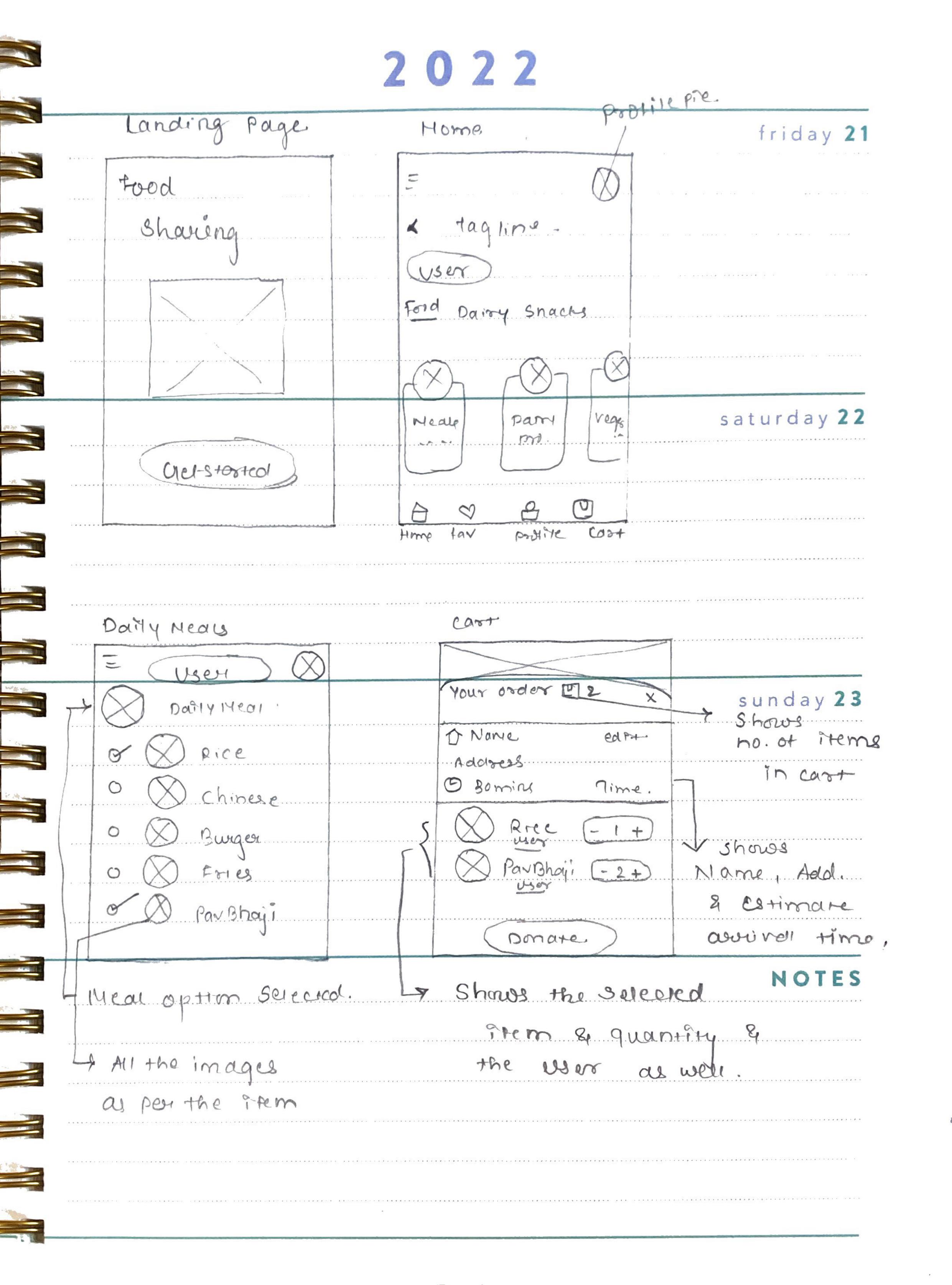
Sketch
Now, I was able to allow my creative juices to flow. Sketching helped me bring the user flow to life. I wanted each screen to feel cohesive and not overwhelming to the eye. As I was sketching, I was able to go through multiple iterations of screens to discover the best possible versions of each screen for my user.
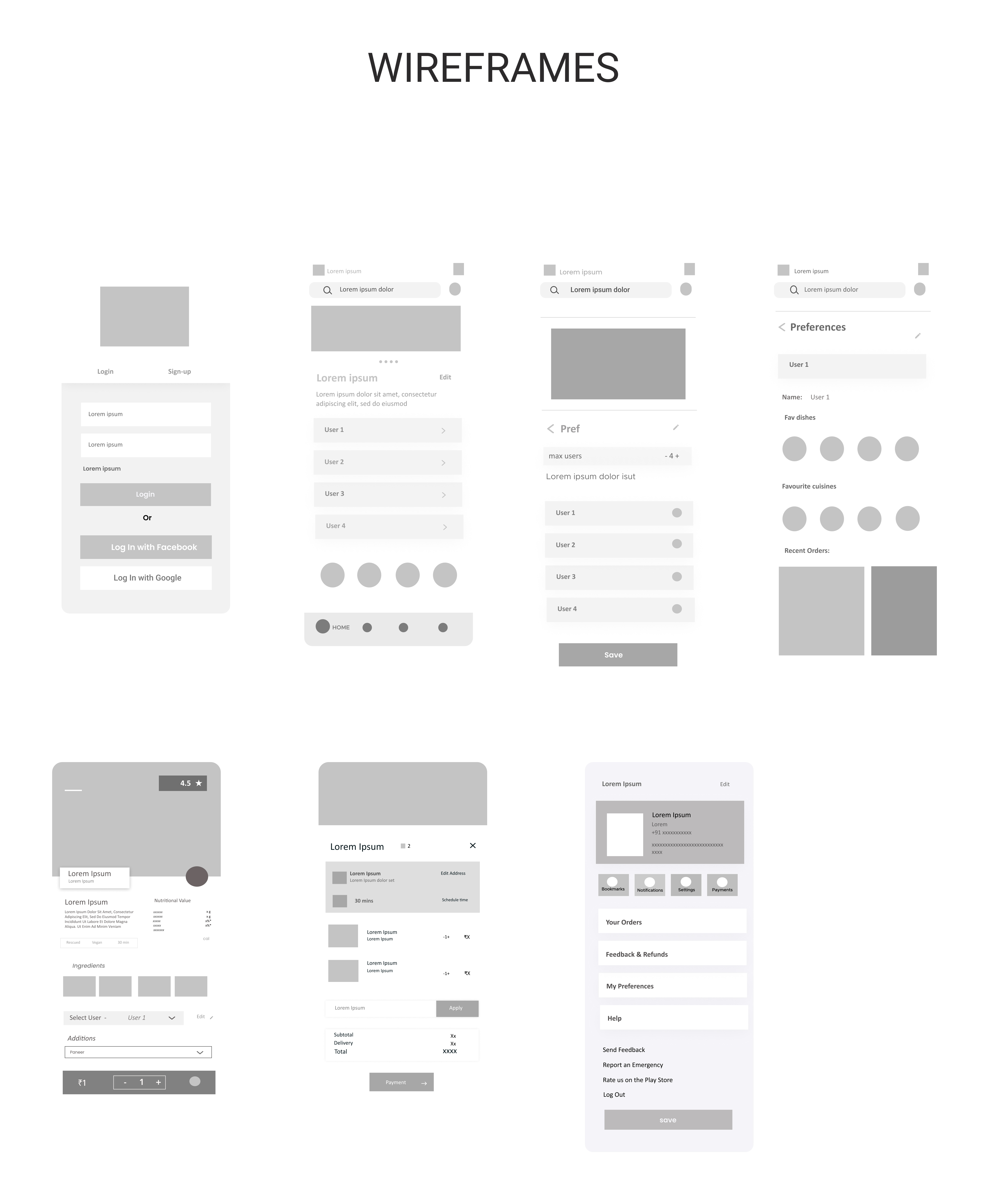
Wireframe
Now, I was able to allow my creative juices to flow. Sketching helped me bring the user flow to life. I wanted each screen to feel cohesive and not overwhelming to the eye. As I was sketching, I was able to go through multiple iterations of screens to discover the best possible versions of each screen for my user.
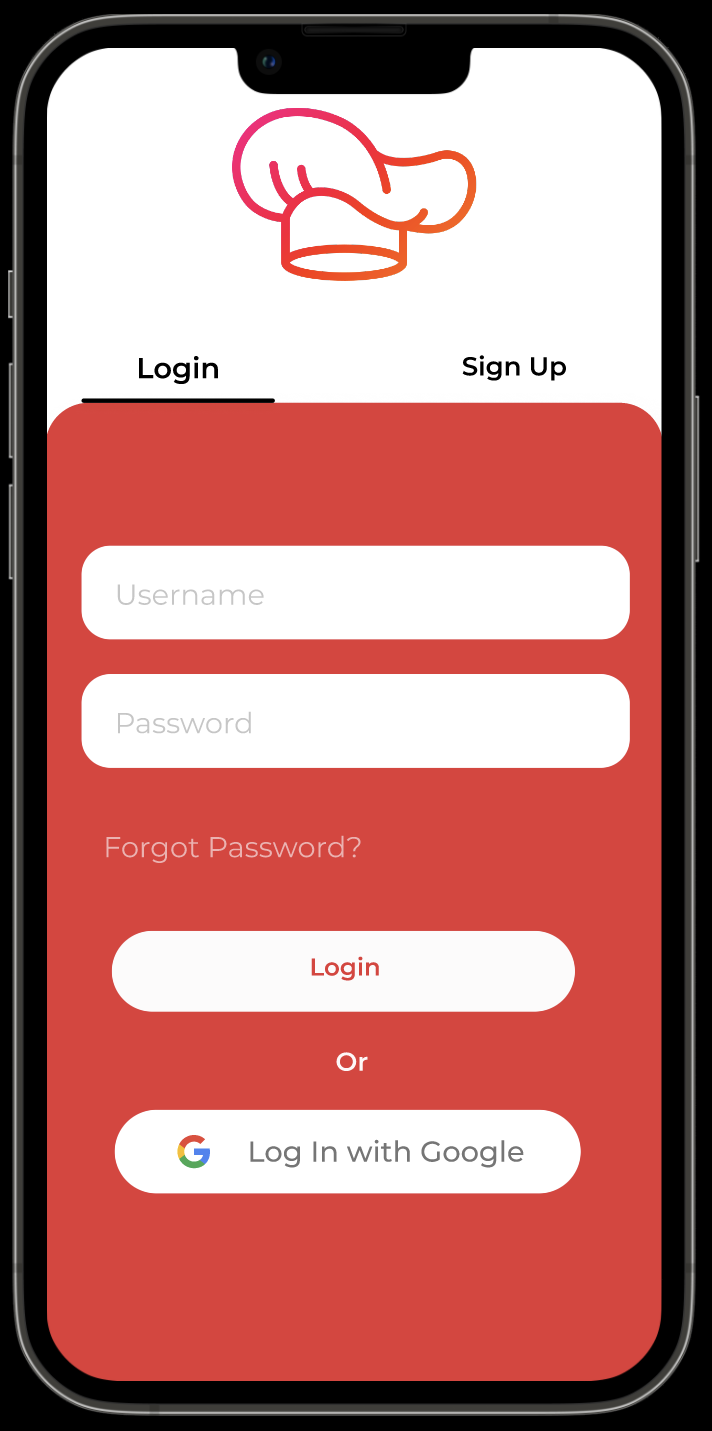
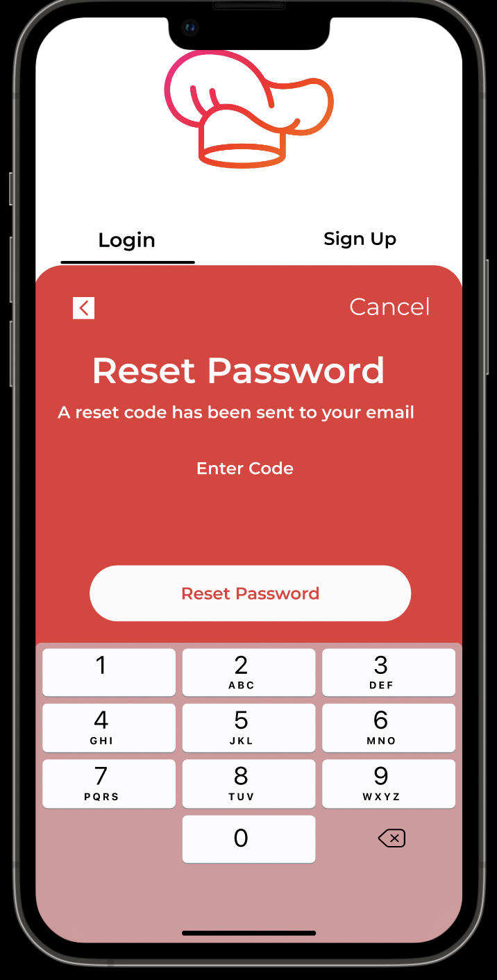
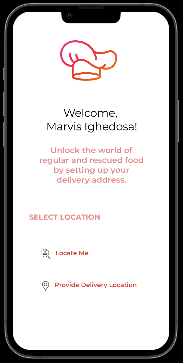
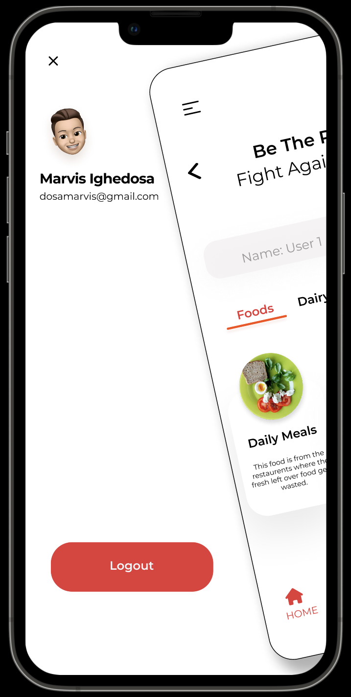
High Fidelity Designs
The style guide was crucial in this step and helped streamlined the process. Since I was finally able to test the style guide ideas out on screens with content, I went back to my style guide to refine some requirements to make sure I could provide my users with the best possible experience.
Test
With my High Fidelity screens created, I was able to create a prototype in InVision and tested it multiple times on myself before I started to conduct usability tests. I wanted to conduct these tests to uncover any usability problems and to improve the overall design. During my design process I try to remove my implicit bias as much as possible but it is necessary to get an outside perspective.
Tasks:
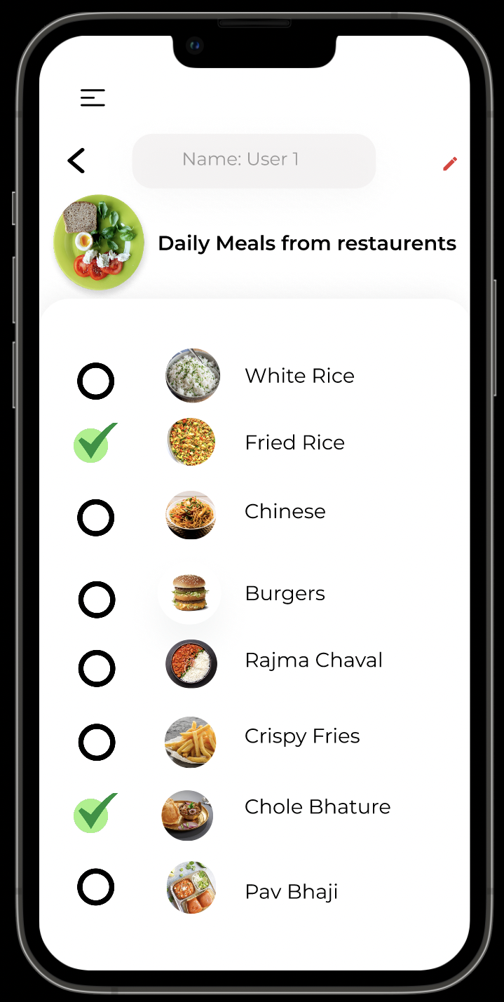
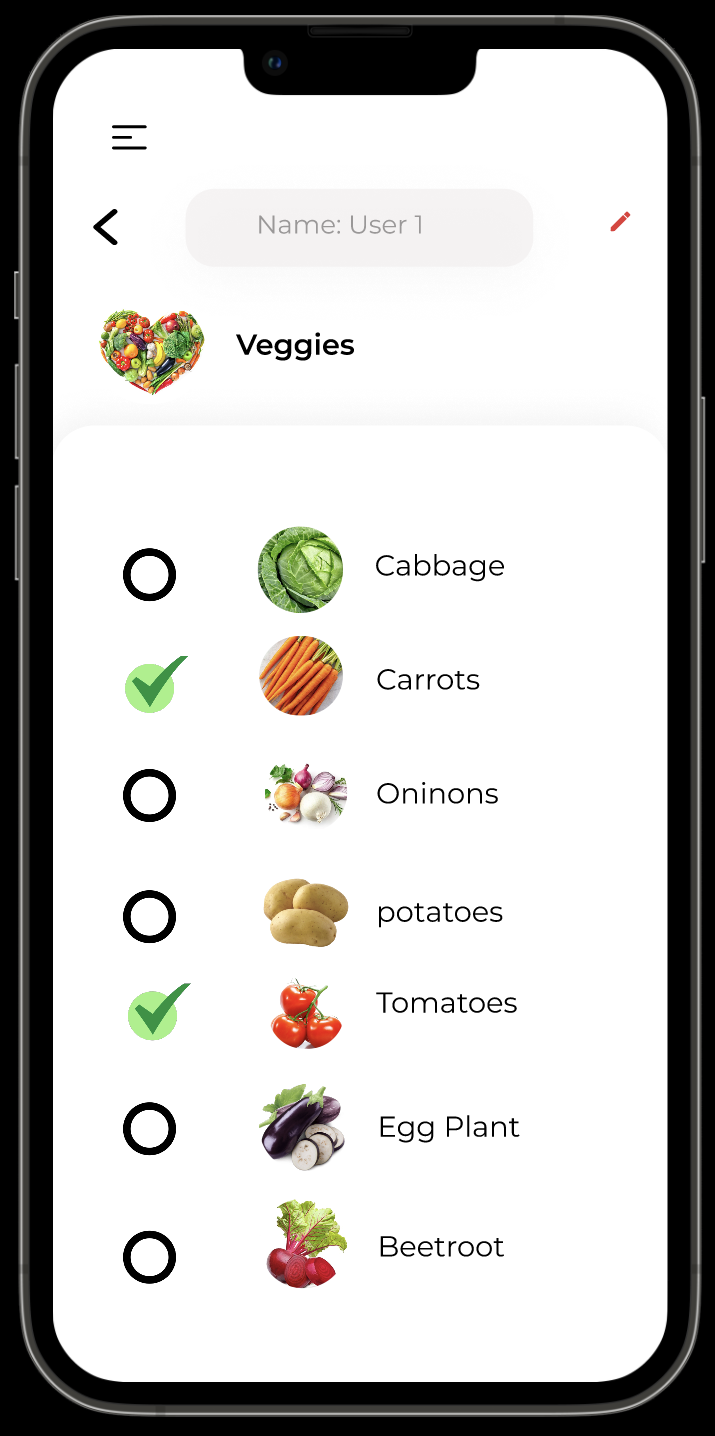
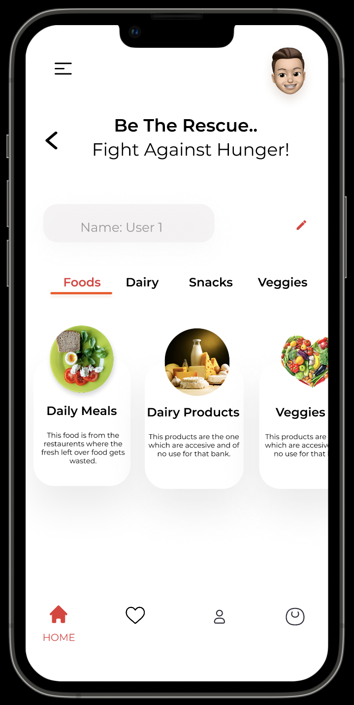
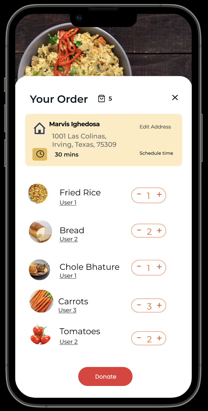
1)You have Fried Rice left in your fridge let me donate them before they go bad.
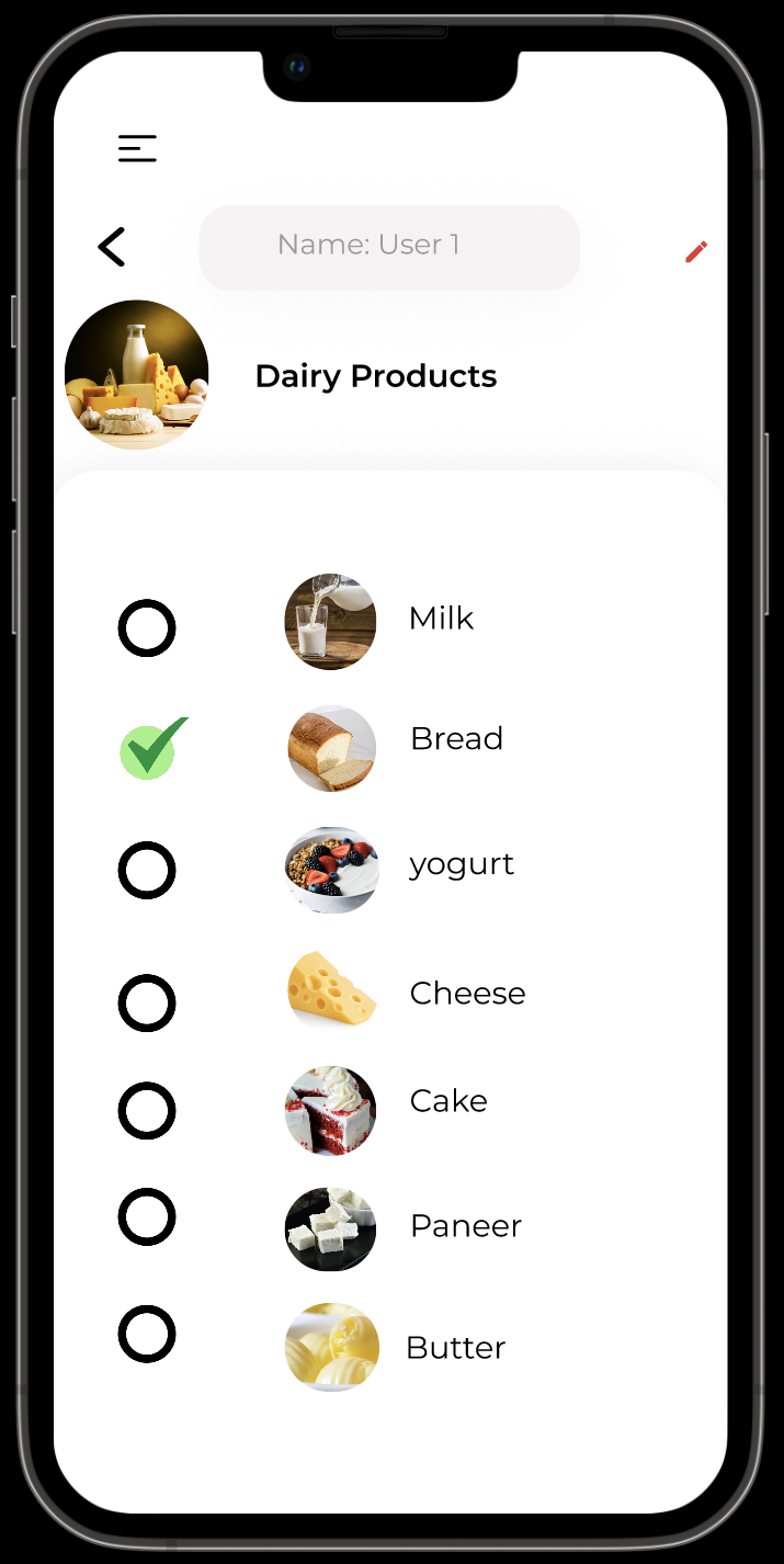
2)Add one Bread to your donation list.
3)Show me how you would add a new items to your list to donate.
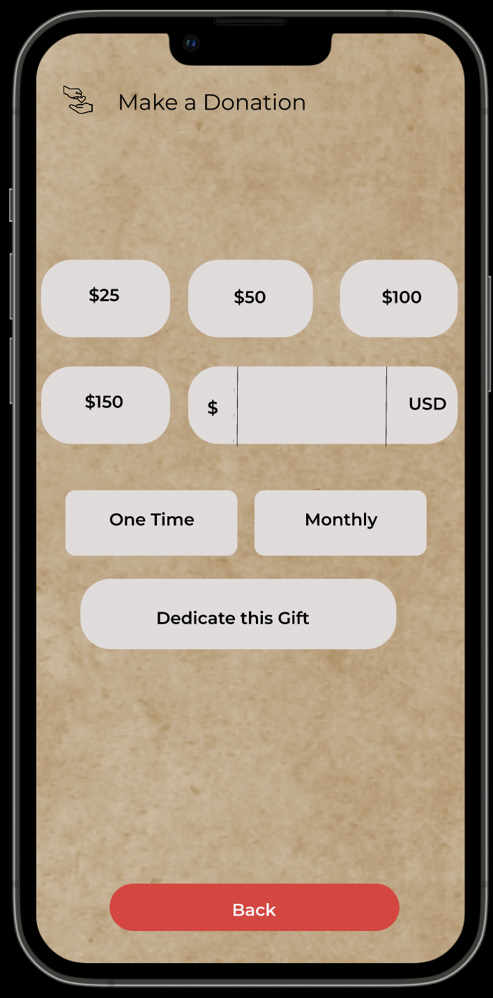
4)Add $50 on monthly basis as donation gift.
Testing Results & Redesigning
Overall, the participants enjoyed using Food Sharing and found it easy to navigate. These tests helped significantly to uncover small design flaws that I need to address. After taking all of the feedback given by the participants, I made minor redesigns to my High Fidelity Frames. I redesigned the top half of the “Explore categories” on home page because participants said it was too cluttered and created a more streamlined process to select the meal.
Refelction
Looking back at all of the work I created, I am extremely proud of myself. As the sole UX/UI Designer of Food Sharing, it was immensely satisfying to see all of my hard work over these past two months come together. I started this project to help individuals be the best versions of themselves and to help give back to our planet that has given so much. As a highly creative person, it was an absolute blast to jump into the creative side of designing this app and had to remind myself multiple times to not let myself get too carried away with grandiose ideas. It is easy to let my creative side flow but it is important to always bring the users perspective back into the forefront of your mind when moving forward.
Thank you for taking the time to read my case study!
bookings
Come Say Hi
I’d love to hear from you!
